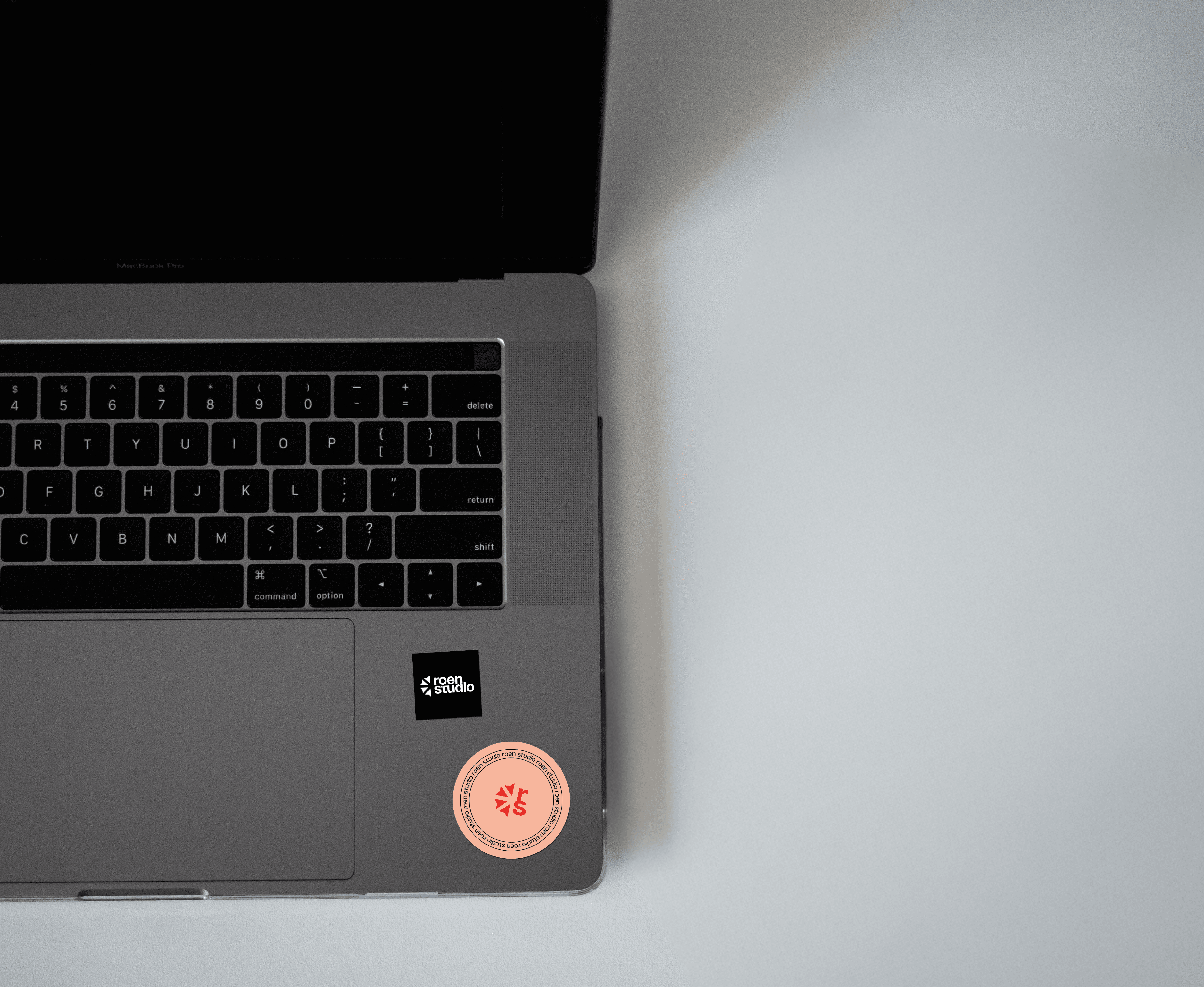
Self-initiated brand identity for Roen Studio.
BRA
IDENTITY
WEB

Problem
Most designers have a logo that does not reflect how they actually work or what they believe in. The challenge was building an identity that was not just visually strong but genuinely true to the process behind every project at Roen, physical before digital, craft before speed.
Solution
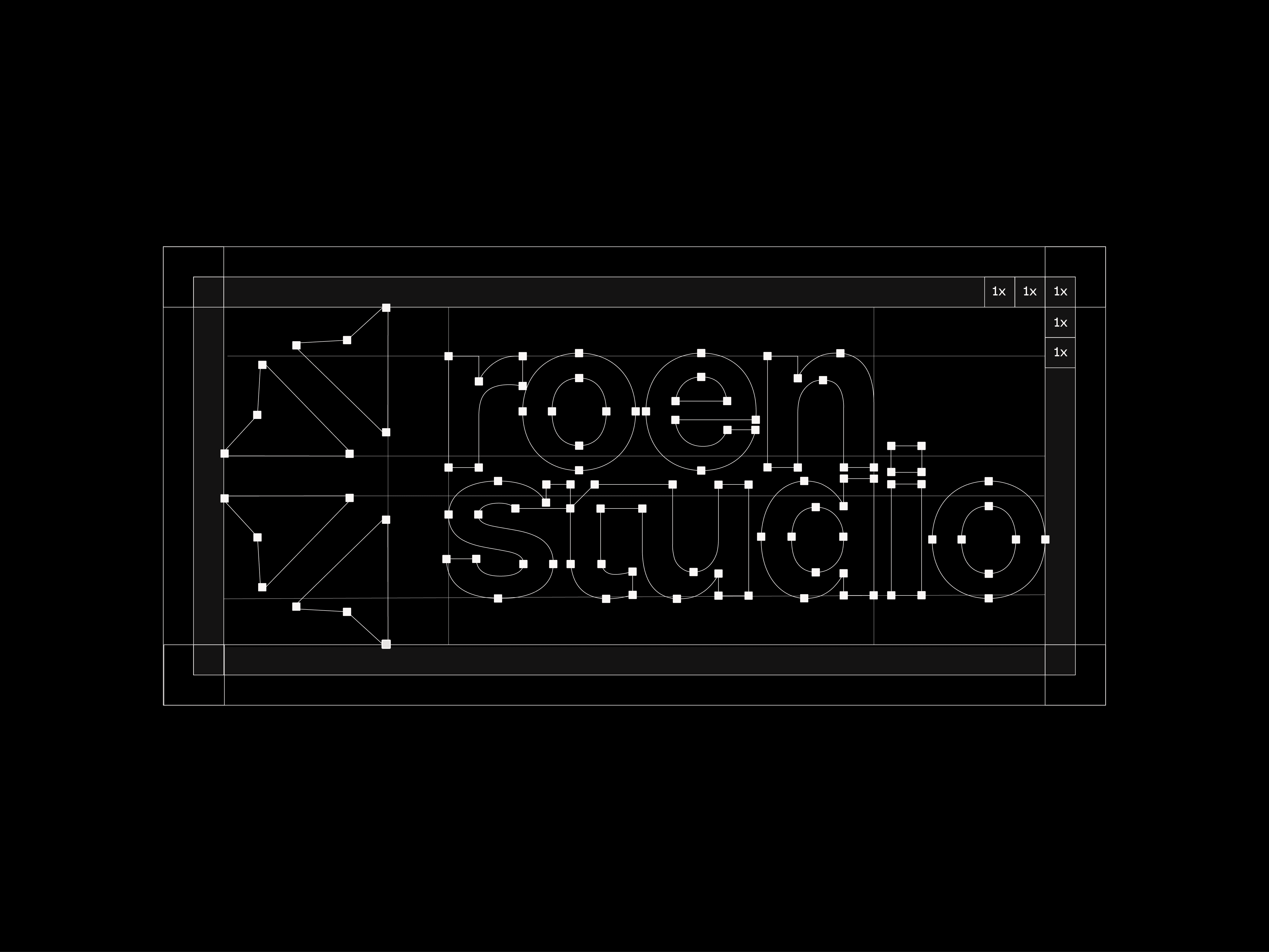
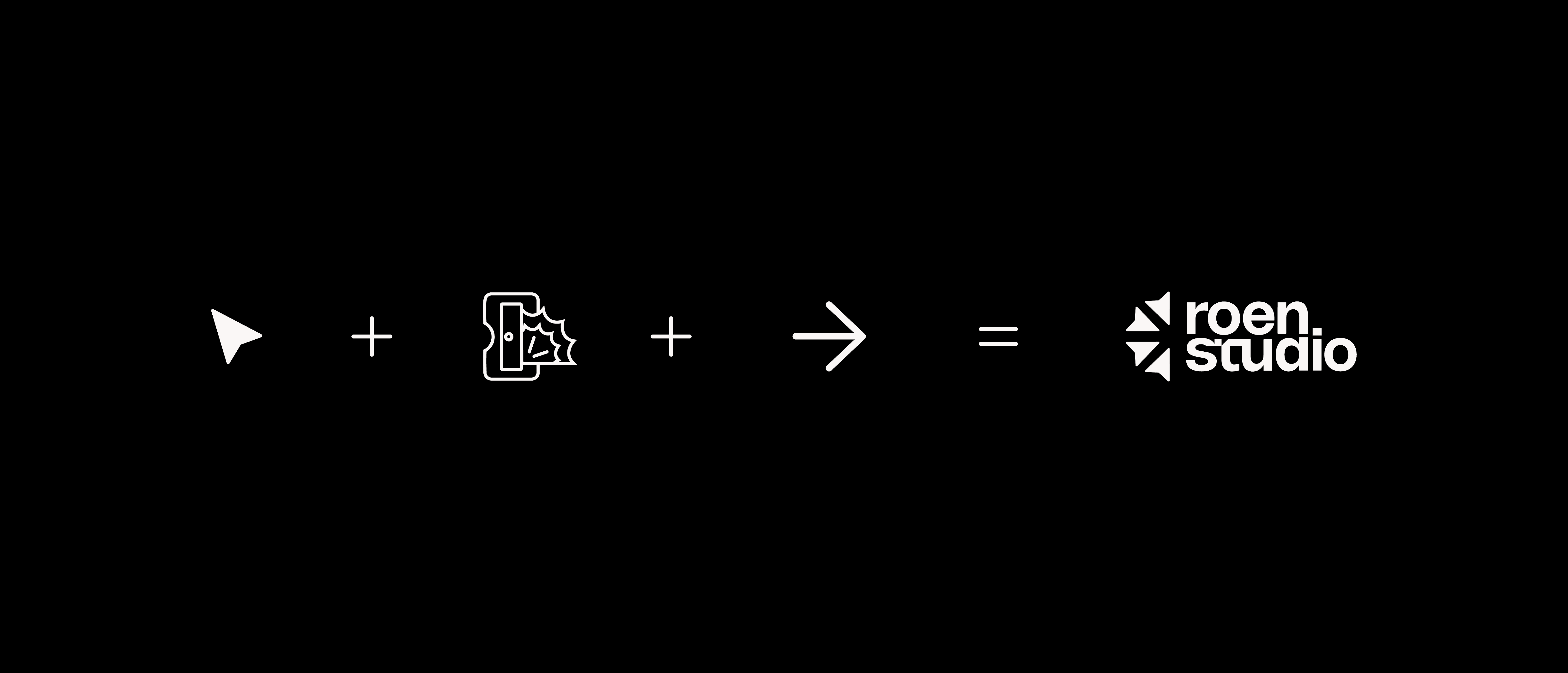
The logomark was built from the direct selection tool, the most reached-for symbol in any Illustrator workflow, until it resolved into something that also reads as a pencil being sharpened. The literal starting point of every project made visible in the mark itself.